| User Interface Design Principles,
with Good and Bad Design Examples To Be Successful, Your Product Must Be Easy to Use The user interface of your product is its most important feature – more important than style, color, shape, speed, or state of technology. If your product is difficult and frustrating to use, customers will reject it, or at best, they will buy a competing project the next time they make a purchase. On the other hand, a product that is straightforward and easy to use has a greater chance of success in the marketplace, even if its feature set falls short of the competition. In this web page, I present some examples of otherwise good products with serious user interface design flaws that could have been easily corrected, at minimal expense, had they been recognized prior to final production. Each example demonstrates a simple lesson that can be applied to a wide range of hardware, software, and consumer products. Form Follows Function The adage "form follows function" means that the function of a device is of utmost importance and that the form, or appearance, of the device must follow the functional requirements. This is not to say that aesthetics and style are unimportant. It only means that the function and user interface of a product must not be sacrificed for the sake of style. Otherwise, you may have a beautiful but useless product, which is admired but not purchased. My first GPS navigator was the Garmin StreetPilot III, which cost me about $500 in 2003. The product reviews were favorable, but I found that it was full of user interface design flaws that made it barely worthwhile to use. Link to WordStar to Text Conversion Page ") One obvious flaw was the design of the slanted control buttons. The four-point "rocker keypad" button had four pressure points located left, right, up, and down with respect to the unit, and misaligned to the slanted oval shape of the button itself by about 30 degrees. Thus, if you meant to press the rocker button in the left direction, but you pressed the left end of the slanted oval, there would be a good chance that you would get up instead of left. This is an example of "function follows form," with disastrous results. Entering a destination address was such a confusing, time-intensive chore, I felt that the only practical way to make an entry was to use the PC-based MapSource software, and then download the destination to the GPS unit. Lacking a PC in the car, one would need to enter the destination manually into the unit. As a public service, I wrote some instructions on this procedure and posted them on the Internet. (The instructions provided in the Garmin StreetPilot III user manual were very unclear.) In the address entry procedure, two major design flaws come to mind. When I entered a street name, I had to specify each letter, one by one, by scrolling through the alphabet. I pressed the rocker keypad right to advance by one letter through the street name, and then up to scroll forward through the alphabet (A, B, C, D, ...) or down to scroll backward (Z, Y, X, W ...). These scrolling directions might seem to make sense at to the designer, but the visual metaphor is an upside-down alphabet: ...
D C
This caused confusion and delay each time I tried to enter a street
name. The proper design would have been to press the keypad button down to advance forward through
the alphabet. B [A] Z Y X ... Another flaw caused me great grief. After entering a destination, number by number, letter by letter, scrolling this way and that, the final step was to select "Find" in the screen and press the Enter key. In addition to a "Find" option on the screen, there was also a Find button. Was pressing the Find button the same thing? No, it was an error that erased everything, taking me back to the very start of address entry! You might expect the Find button do the same thing as the Find screen option, or failing that, at least do nothing. The next GPS unit I bought, the Garmin StreetPilot C330, provided an example of good user interface design, as described in the next section. Make the User Interface Intuitive and Obvious The user interface should guide the user to the desired action with little or no chance for error. Ideally, this should be possible without reading the user manual, or if that is not possible, a brief "quick start" user guide should be sufficient to give the customer access to the most commonly used features of the product. My second GPS navigator unit, the Garmin StreetPilot C330, very nearly achieved this goal. Instead of buttons, it has a touch screen and a fairly simple and straightforward set of menus. To enter a street name, you type the letters displayed on the screen, like a typewriter keyboard.  A measure of a product's usability is the size of its user manual. A well-designed product requires less documentation, and a perfectly designed product requires no documentation – the customer simply picks up the new product and begins using it without reading anything beforehand. The Garmin StreetPilot C330 almost meets this goal. You can pick it up and navigate to a destination by following a sequence of obvious prompts: Where To? ...
Address ...
Choose State ... Enter City ... Enter
Number ... Enter Street ... Go
This sequence is fairly obvious, even if you have never looked at the manual. This in an example of good user interface design. The product comes with a very thin manual, just a few tiny pages, along with a larger PDF manual showing the finer points of usage. The user interface could still be improved. Users should be allowed to enter the house number and street together in a single line, just as they would when writing an address on an envelope, rather than two separate entries for number and name. Also, numbered street names such as "First Street" must be entered as numbers such as "1st"; a spelled-out name such as "First" ought to be accepted as well. Making improvements such as these may require the internal implementation to be more complex, using more engineering resources. However, the payoff is a better user experience, more repeat sales, and lowered support costs. In contrast with my newer GPS unit, my cooking stove provides an example of poor user interface design. My complaint is with the mapping between the four control knobs and four burners. The stove-top layout is shown below, with the four burners arranged in a rectangle and the four controls arranged in a row along the right-hand side. If you were designing this stove, which knobs would control which burners? How would you indicate to the user the mapping between control knobs and burners? 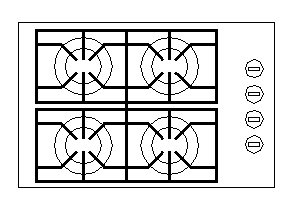 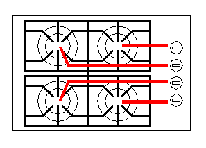 
I have been using this stove every day for the past seven years, and I still have trouble remembering which knob to use for a given burner. On several occasions, my family members have left on the wrong burner, leading to the burning of an empty frying pan. It would make much more sense to have the inner knobs control the burners on the right and the outer knobs control the burners on the left. Then the central knobs would control the closer burners and the outer, more remote knobs would control the far-away burners: 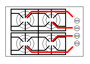 Ideally, the knobs would be arranged as a map corresponding to the actual layout of the stove. Then the mapping between knobs and burners would be entirely obvious, and no markings would be necessary: 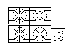 Use Assertive Words as Labels and Commands My car is a 1996 Mercury Villager minivan. The doors can be locked and unlocked by operating a switch on the driver's door. The switch rests in a central position. Pushing the switch forward (toward the front of the car) locks the doors, whereas pushing it backward unlocks the doors. The backward direction is marked with the word UNLOCK and the forward direction is unmarked. 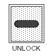 The designer made a correct decision to mark only one side of the switch. It makes sense that pushing the switch toward the labeled action carries out that action pushing it away carries out the opposite action. However, it would have been clearer and more intuitive to label the assertive action LOCK rather than the negative-action term UNLOCK. 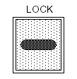 Even better than the word LOCK would be a symbol or icon that can be recognized by anyone, not just those literate in English. Almost anyone, from any culture or background, recognizes a padlock. 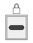 Would it be better to show both a locked padlock symbol in front of the switch and an unlocked one in back of the switch? I don't think so. This would just visually clutter the switch and make it harder to see and remember the "lock" direction. A single lock symbol is entirely clear: push toward it to lock or away from it to unlock. The designer made a very good decision about the electric window controls. In some cars, the windows are controlled by a switch that can be moved forward and backward. In that case, there is no obvious relationship between the switch direction and action taken. In my Mercury Villager, you lift up or push down the window control switch to raise or lower the window. In other words, you move the switch in the same direction that you want the window to move, which is immediately intuitive and obvious. Usability Is More Important Than the Feature Set I have a "Tech4o Accelerator Watch," which is a pedometer-wristwatch that senses and counts your arm swings, so you have an idea of how far you've walked. The product is generally good and has many features. However, it is so complicated to use, I don't use any of the features except for the current time and number-of-steps counter. Take a look at the settings and usage diagram from the instruction booklet:  The first thing you want to do when you get this watch is to set the time. It is an extreme challenge to figure out how to carry out this simple task without consulting the instruction booklet. Even then, it's not easy. To carry out even simple actions or settings requires focused study of the instruction booklet. What could be done to simplify the user interface? I can think of several ways, but the first thing is to drop seldom-used features from the design. For example, the watch has "dual time" feature, which means you can display the time in a different time zone, either simultaneously with your home time zone, or temporarily when you press a button. If you live in Los Angeles and often travel to New York, would you need the watch to tell you that it's three hours later when you're in New York? If this feature were dropped, few would miss it, and the user interface and display would be simplified for everyone. The watch has four buttons: one to turn on the night-light and three to control the watch/pedometer display and settings. Holding down a control button for a couple of seconds often has a different effect from simply pressing the same button. This difference between pressing and holding is very confusing to users and should be avoided, or at least minimized, in the user interface. Design the Interface for the User, Not for the Product It might seem obvious that the user interface should serve the user and not the product. Yet designers sometimes become too focused on the product itself and forget the human being involved at the top level of the design. Many years ago, I had an occasion to make a photocopy of a 20-page document. The office copy machine was not designed to handle a stack of sheets to be copied, so I had to feed the sheets by hand, one by one. Each sheet could be fed only after the previous sheet was copied and the machine was idle. The machine had two LEDs to show the current status, one red and the other green. Think about this – which colors should be used to indicate "machine busy" and "machine idle"?
The designer forgot to view the product from the user perspective. When the machine is active, the user is idle; and when the machine is idle, the user is active. The LEDs are there for the benefit of the user, not the machine! This particular user interface flaw should have become apparent during product testing, but somehow it was overlooked. Summary of Lessons Learned
|